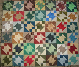
I think this quilt of Buckeye Beauty blocks is one of the busiest I've made. When I look at the photo from a distance they look star-like to me but up close and in person . . . whew! My eyes bounce all over the place.
I planned for 42 6" blocks plus a border. These are the 42 blocks, not yet sewn together.
I looked at the layout above for a few days and then today I pulled the green ones and laid them together. Hmm. Better, but still bouncy. And maybe a little boring?
This was a quick change from the layout of all blocks and a quick photo. You may (or may not) notice that the top row is out of arrangement with the rest of the blocks. The blocks are not identical: the light centers are oriented in one direction diagonally and the dark centers oriented in the other, and the 4-patches in the corners are arranged differently for light and dark blocks.
I'm trying to decide whether I really want to make this (in either multi or green) for a grandbaby quilt. Maybe it will work if I just make some changes in future blocks. Maybe the really light lights are too light. Or maybe it is just too busy. Or maybe there are too many different greens for such a small quilt. I can't quite put my finger on why I'm not happy with this quilt/these blocks.
There were six red blocks which I laid together. Still bouncy but since red is my favorite color, I like them better.
I guess I'm still scouting around for the perfect block/quilt for my grandbaby boy. If not this quilt, I know I'll find one soon.
I hope you have a great weekend.
--Nancy.
.


I actually like all the blocks together! Maybe it's the blue blocks that help liven up the green? Another group of blocks to keep going back to until you find the satisfactory arrangement ☺
ReplyDeleteYou're right, Allison. I'll probably be looking at these blocks for a few days or a week. It's interesting to read other people's opinions.
DeleteI just went back to look at the photos again and I think the green blocks together are positively boring. I may just need to change the layout of the mixed colors, or maybe substitute a few other blocks. I'll figure it out soon, I hope.
Thanks for visiting and leaving a comment. I appreciate it.
I, too, love all the blocks together, which surprises me as I'm usually a fan of controlled scrappy and simpler designs. But it's your quilt (for now) so you need to find the colorway that works for you ... and I know that you will.
ReplyDeleteThanks for your words of encouragement, Kathy. I think I'll "watch" it for a while and see if it grows on me. And maybe play with the arrangement and/or lay the blocks out on a piece of green fabric to help imagine a border and see what I think. I'm grateful there's no deadline!
DeleteThanks for leaving a comment with your thoughts about the quilt.
If you think the blocks are to busy together, try adding some sashing between them to see if that calms things down. I do like your block! So fun to make baby quilts!
ReplyDeleteMy husband asked if I was going to put something between the blocks and I told him I didn't think so, but maybe that would calm and help unify the blocks, Gayle. Maybe I'll try it.
DeleteThanks for visiting and leaving a comment.
I like the reds especially. You can see with that color the squares which are formed as well as the diagonals. Maybe the sets of colors could go around each other: ie reds in the center, surrounded by blues, then greens then yellows. Just for example. I like the blocks-they are unique.
ReplyDeleteI like those reds, too, Pam. In fact, I'm thinking about making more red and light blocks for a separate quilt.
DeleteGreen is dominant because my daughter suggested green. She wasn't sure flowers would be good for a boy, either, which limits my green fabrics (since I'm trying to use what I have). But I like your idea of putting the colors together and will give it a try. Thanks for suggesting it.
It is easier to see the secondary pattern in the monochromatic color scheme, and the red is my favorite....but, then, red is my favorite color, too. That being said, I still like the scrappy version, too.
ReplyDeleteYou're right, Jennie. I think it helps that the reds and lights have very little value difference in them, too, which makes the pattern easier to see. Thanks for sharing your thoughts. I appreciate it.
DeleteIf you think it is too busy, sometimes even just a border gives the eye a place to rest when there is a lot of activity in the quilt.
ReplyDeleteI like all of the above.
The quilt in the book has a border, Janet, but I forgot the impact a border can sometimes have on a quilt. I'll try out several and see what happens. Thanks for the reminder and suggestion.
DeleteI love all the blocks together! Maybe a border in your favourite colour - red - is all that's needed to create a calmness?
ReplyDeleteThanks for adding your thoughts about the quilt blocks, Linda. I would think about a red border except that my daughter suggested a quilt with lots of green, so I'll probably try several greens and see what I think.
DeleteThanks for visiting and leaving a comment.