I'm expecting a fail with this new version of Blogger but I'm hoping against it.
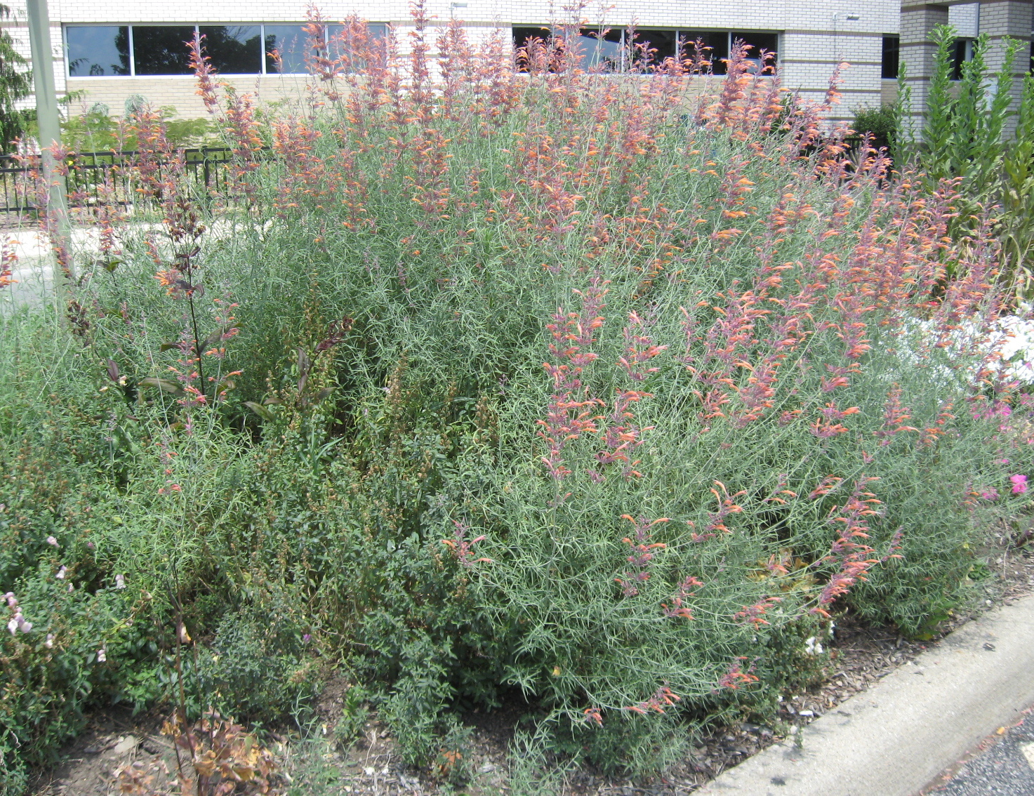
Let's try a photo.


Now let's try a preview. Nope, not so good. It won't show me a preview. But wait, the fine print (or the little box at the bottom left of the screen that pops up and disappears before I can read it) says, "Preparing preview." Waiting, waiting, waiting.... And, it's still not available after a trip downstairs to take laundry from the dryer. I depend on previews. And after more than 20 minutes, the only way I can see a preview is by returning to Legacy Blogger.
Why is the font so large in the column on the right with labels, etc.? In old Blogger all the icons are across the top and easy to use. Now, I have to click the column of three dots to see more options.
And why is everything so spread out? I'm in favor of conserving space so I don't have to race my mouse all over the screen to do a few simple things.
And what was wrong with the old Blogger, anyway? (Can you tell I don't like change?)
Google Blog tells me it wants to create an "easy and intuitive experience" for anyone who wants to blog. I think they mean the people who blog from their cell phones or the people who are tech savvy. I know it doesn't mean me because there is nothing easy or intuitive about this newest version of Blogger. Maybe Blogger really wants to discontinue the blogging platform and drive people to Instagram or some other method of sharing. Or maybe it wants to re-attract the younger folks who've already moved to Instagram. I'm sad to say it may drive me away from blogging altogether.
But wait! There may be one good thing about this new version. I can click on a photo and change the size by dragging a corner. That was a wonderful option in the first version of Blogger I ever used, the one before Legacy Blogger. (Except sadly, it doesn't always work.)
So, I'll continue to use Legacy Blogger as long as I can and maybe try to practice with the new Blogger.
I really, really don't like change. (You can probably hear me sighing all the way from here to there.)
--Nancy.
.
Why is the font so large in the column on the right with labels, etc.? In old Blogger all the icons are across the top and easy to use. Now, I have to click the column of three dots to see more options.
And why is everything so spread out? I'm in favor of conserving space so I don't have to race my mouse all over the screen to do a few simple things.
And what was wrong with the old Blogger, anyway? (Can you tell I don't like change?)
Google Blog tells me it wants to create an "easy and intuitive experience" for anyone who wants to blog. I think they mean the people who blog from their cell phones or the people who are tech savvy. I know it doesn't mean me because there is nothing easy or intuitive about this newest version of Blogger. Maybe Blogger really wants to discontinue the blogging platform and drive people to Instagram or some other method of sharing. Or maybe it wants to re-attract the younger folks who've already moved to Instagram. I'm sad to say it may drive me away from blogging altogether.
But wait! There may be one good thing about this new version. I can click on a photo and change the size by dragging a corner. That was a wonderful option in the first version of Blogger I ever used, the one before Legacy Blogger. (Except sadly, it doesn't always work.)
So, I'll continue to use Legacy Blogger as long as I can and maybe try to practice with the new Blogger.
I really, really don't like change. (You can probably hear me sighing all the way from here to there.)
--Nancy.
.