Occasionally, a topic of conversation will come up between my daughter and me that is the subject of a recent conversation. These topics are never sensitive or hot topics, but things like a shared memory, a funny scene from a movie, or a recent event that one of us mentioned a few days before. Sometimes we sense the topic coming up again and one of us will say, in jest, "You do go on." And we'll both laugh, knowing what would have been coming. (I don't how we came to use the phrase "you do go on.")
If you happen to have read two recent posts about this quilt and are now reading this one, you might think to yourself, "She does go on about making that quilt." And I would laugh and agree. Sometimes I need to write down thoughts and share photos in hopes having a different view or of someone pointing out what I don't see myself. So here I am, going on about this quilt. No hard feelings if you're sick of it and leave before reading.
I finally resorted to taping a sheet to the floor in hopes of keeping the cats from playing on and with the blocks. I thought it would prevent them from sliding across the floor and into the blocks. It's helped but has not prevented the cats from being on the blocks. Those cats just love fabric and quilts! Ah, well....
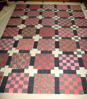
Since I finished the blocks, I've been trying different possible sashing options. I have several iterations to show. You may have to look closely to see them.
I had decided I would probably use coral squares at the ends of the sashing to help create nine-patches, but then I saw these off-white pluses before I'd placed coral squares and had second thoughts. They certainly give the eye a place to rest, even more so than the nearly-black sashing. Then I put a few plaid squares in the centers (with several blacks near the top), just to see. I don't think the plain pluses work well for this quilt.
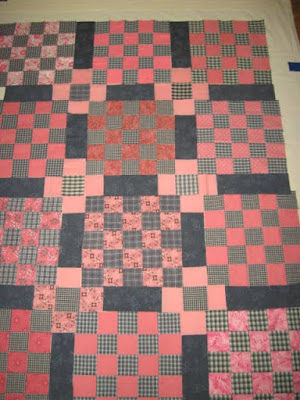
Below are the corals at the end of the sashing strips. After looking at the white, these seem, maybe, a little too closed--too much of the same color. Do you think the off-whites or the corals look more vintage, which was my original intention with this quilt?
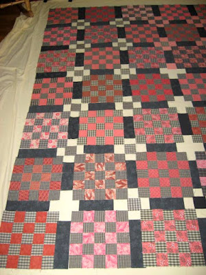
And below, white with plaid squares in the centers. I liked these when I first saw them but then I thought perhaps it was just an easy out from deciding which coral fabric(s) to use. And grey centers or black? Not coral centers because it would break up the diagonal pattern of dark plaids.
Scrappy coral fabrics at the ends of the sashing strips, and off-whites on the other side, for side-by-side comparison.
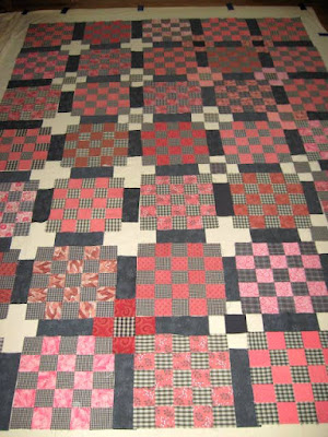
Below, there's one black center, and several different coral fabrics, including one bright red/orange near the bottom. If coral fabric, all the same fabric (for as many as I have fabric, and then a similar fabric) or a scrappy variety of corals?
I've decided against that red/orange fabric in the photo above. And I'm really having seconds and third thoughts about the corals in the sashing. They don't really do what I thought they might, which is create a nine-patch secondary pattern. I'm leaning toward off-white squares at the ends of the black sashing and black center squares. But then again, plaids in the centers might be better....
The next consideration will be binding color. There will be no borders on this quilt, just the 25-patch blocks with sashing. Black binding? Coral binding? It's never too early to start thinking about that. (The blocks in this quilt will finish at 10" and the sashing will finish at 2". Before quilting and washing/drying, the top should be about 58" x 82". Long and thin with plenty of length to tuck under to keep feet warm.
I know the decisions for a quilt are purely personal but I am interested in what you see and what you think of the possibilities in these photos. Thanks for sharing, dear readers.
And now I'm done going on about this quilt, at least for this post. Hopefully, the next time you see these blocks will be when they are sewn into a top. Won't that be grand?!
I'm linking this post to
> Oh Scrap! at Quilting is more fun than Housework
> Design Wall Monday at Small Quilts and Doll Quilts
Thanks for hosting, Cynthia and Judy.
--Nancy.


The full white plus seems too stark a contrast. The plaid in the middle of the plus has a softness to it which is more pleasing to the eye. My opinion. One must ultimately choose the one they like best. Good luck. Dotti in CT
ReplyDeleteThanks for sharing your thoughts, Dotti. The plaid in the center of the off-white is exactly how I'm sewing the blocks. I hope it looks as good as I think it will!
DeleteMy favorite of the options you have shown is the off-white squares with the plaid for cornerstones. I agree that the coral squares in the sashing blends in too much and the all-white pluses steal focus from your blocks.
ReplyDeleteThank you for sharing your observations and thoughts, Julie. The off-white and plaid cornerstones is what I chose. I'll post a photo when the top is finished.
DeleteMy favorite option is the coral squares...I love the depth of the pink/corals it gives...and highlights those grayish sashings beautifully. Hugs, Julierose
ReplyDeleteThanks for telling me your favorite, Julierose. I appreciate it.
DeleteI like the off white with plaid in the center - but I am sure everyone will have a different opinion:)
ReplyDeleteThank you, Maggie. Yes, there were lots of different options. My opinion is the same as yours.
DeleteI like the off-white 9-patch effect with plaid centers. But the very lightest coral gives the effect you want too. So another option is to made all of them from the same coral fabric.
ReplyDeleteThank you, Nancie. I had thought of using one coral fabric but didn't have enough of any of them. I finally chose the off-white with plaid centers. I hope it looks like I think it will when it's all sewn together!
DeleteI'm impressed with your ideas! The black hit me as my fave but I will look more carefully and decide. // Seems to me the binding should be random and striking. Cheddar? Lime green? Black and white stripes on crossgrain for a modern touch? [I think I have extra if you need/ like.] // I love when you ''go on'' about your projects! Your design thoughts, musings are so interesting.
ReplyDeletePS "You do go on " was a rude put down in my family, a way of saying Shut up, enough!
love
lizzy
Thanks for sharing your impression, Lizzy. I don't know what I'll do for binding yet. The quilt is so busy already, I hesitate to add more busyness with the binding. I can't imagine cheddar with these corals and would not choose lime green. (Of all the greens, I think it's my least favorite.) But maybe stripes.... I suppose I was premature in thinking of binding when the quilt wasn't (and still isn't) sewn together and has yet to be layered and quilted. It has a long way to go before binding.
DeleteIt's interesting how different families use different phrases. I could never say "you do go on" to my husband, even in the context that my daughter and I say it and laugh. On the other hand, if someone in our family does go on and on, I try to be patient and understand how important/hurt/unhappy the person is about whatever they're going on about. (Sadly, I don't always succeed.) People are so fragile.
The iteration just before adding the white was attractive. Black or a dark Kaffe stripe would bind nicely
ReplyDeleteThank you for sharing your thoughts, Anonymous. I wasn't sure which photo you meant when you said the one "just before adding the white" because all but one of the photos has white squares. I think you're right that black or a Kaffe stripe could be a good binding.
DeleteWow! So many options, I don't really have an opinion, they all seem to be good options. So, I'm no help. I think it's nice you have that kind of relationship with your daughter. I, like Lizzy, like to hear your design musings and can identify with the indecision. I always try out everything before I come to a conclusion.
ReplyDeleteI'm so grateful that my daughter and I do have that kind of relationship, Robin. She's fun to be around.
DeleteIn the past I've agonized over quilt-making decisions--color placement, patterns, fabrics, block arrangements, almost every aspect of the process--but this time I'm approaching it as play, with no deadlines, no worries, and no concerns about making mistakes and using/misusing fabric. It seems like these black/neutral/grey plaids will go on forever. I think I have about four nearly-whole shirts yet! Still, we are similar in trying out lots of options before deciding.
The cream/white pluses--even with gray/plaid centers--pop a lot and claim all the attention. The coral/gray fade too much. How about coral/gray with black center? I know, all you need is yet one more option.
ReplyDeleteI'm always ready to hear/read another option, Claire! It amazes me how often someone will mention something I didn't think about.
DeleteIn the fourth photo I did have two blocks arranged as you described. I might have gone with it if I'd had enough fabric of one coral, but I didn't, and didn't think using a variety of corals would work well. I hope the choice I made looks as good as I hope it will!
Before making your final decision if you have a particular room or bed where the quilt will live, you might take the blocks into that room and see what you like best in that particular lighting and room color. Beyond this, I don't have any insights to offer. Lots of good options and opinions here.
ReplyDeleteThanks so much for that suggestion, Pat. It is one I wouldn't have thought of for any quilt I'm making. It's a great idea! This quilt isn't being made for a particular room or a particular person. I'll probably pass it on when it's finished. Or I may finish the top for Sarah Craig's Hands2Help Comfort Quilt Challenge this year. I noticed the MCC is asking for tops only.... (The link is at https://confessionsofafabricaddict.blogspot.com/2023/03/are-you-ready-for-hands2help-comfort.html.)
DeleteIf you're going to use the off-white, definitely the plaid. I think it looks more vintage with the lighter coral pluses and grayed plaids, but either one will look good. Good choice to take that red/orange one out.
ReplyDeleteThanks, Susan. I did choose the off-white and the plaid. I felt like I was drowning in coral when I used those in the sashing. I tell myself that several choices can be great and even though I can make only one choice per quilt, I can make another quilt with the other choice. Not that I ever have, but it's an option.
DeleteWell I had to scroll back and forth to decide what seemed to "sing" to me. Actually I really like the light coral squares with the plaid centers. The light coral stands out gently, without screaming for attention. My second choice would probably be the off-white with plaid centers. Just MHO. Anything you do will make this a lovely finish. Personally I would probably bind it in the black or grey.
ReplyDeleteThank you, Janet. I might have chosen the coral squares if I'd had enough of one fabric, but I didn't. So I went with off-white with plaid centers. I hope it looks as good as I think it will!
Delete