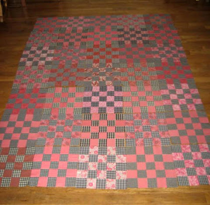
My self-imposed challenge was--is--to use a group of black and grey plaid fabrics from shirts and a group of fabrics in the coral color-range to create a quilt. The point is to use up those plaids! I made a quilt using black plaids a year ago and learned that the plaids blend to grey when viewed from a distance. (Yes, this quilt is using more of the same plaids from that quilt!)
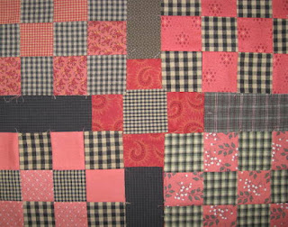
On the other hand, I learned from this quilt that while the black plaid fabrics may look grey, their value also varies depending on the proportion of black and light in the plaid. And also possibly depending on the direction of the plaid. Plaids are so variable!
Add to the above the variations in the eight or so coral fabrics I used--varying from prints that look light to solids and prints that are brights and darks--and I have a busy mess of blocks. But it's a scrap quilt, I tell myself....
Each block has 13 plaid and 12 coral squares. My decision to make the plaid dominant was based on the fact that I had more plaids than coral fabrics. I still have plaids left but not much coral fabric.
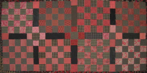
I am to the point of auditioning sashing. In my original post about these blocks you readers left some wonderful comments. Several of you suggested no sashing. In person, all the plaids jumble my eyes which makes me think they need some space between. So I'm choosing to use sashing. Several of you suggested that if I were going to use sashing that black might be too dark/stark. I had the same impression.
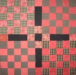
I auditioned several grey shirt fabrics, none of which have enough fabric to make sashing for the whole quilt. The greys seem to disappear. After trying out several greys, I decided black might be the best option after all. (See photos below and at the beginning of this post.) I think the black or very dark grey sashing will give the quilt some unity, continuity, and structure and help it look cohesive.
The other thing about this quilt is that I'm trying to use up fabric, not buy more fabric, which means I'm hoping to use what I have, though I admit to stopping at the thrift store this afternoon....
This brings me to the next decision about this quilt, and that is whether to put coral squares at both ends of the black/dark grey sashing. I like that it will create a secondary pattern across the quilt--a 9-patch in the center of the black sashing.
At least that's what I think will happen. I've cut and laid out only a few strips of black sashing. I think the sashing will also give the eye a place to rest.
Another consideration is fabric for the squares at the ends of each black sashing piece. Coral, I think, and all the same fabric, if possible, for continuity's sake. The fabrics below are possibilities, shown with with pieces of the fabrics I used to make the blocks.
The fabric on the left has less than enough for the squares, but I think it looks best of the ones I have. The fabric on the right seems too dark, maybe a little too red/orange, and blends into the plaids. (See top photo, center square.) I'll cut black strips, then lay out the quilt and play a little.
It does occur to me that I could choose a completely different color range for the sashing strips and squares but I don't know what color that would be....
Do you have any insights to share about how to unify scrap quilts to make them look cohesive? Thank you if you do.
In the whole of human experience--even in the whole of my own personal experience of 70+ years--choosing fabrics and colors for a quilt is a tiny, brief fragment of life. Insignificant, really, and probably not worth all the time and thought I put into it. And yet, I'm continually striving for improvement--being better, doing better, making better--each next time an interaction or experience comes my way. That being said, I have to remind myself that each quilt I make does not have to be better than the last. And thank goodness for that! (But even so, I unconsciously set that as one of my goals when making a quilt.)
I thought this Cara Cara orange was so beautiful that I should share it. Citrus fruit isn't a favorite but I do love the smell and beauty of oranges. I'm linking this post to
> Oh Scrap! at Quilting is more fun than Housework
> Design Wall Monday at Small Quilts and Doll Quilts
Thanks for hosting, ladies.
I hope you are well and thanks for sharing comments!
--Nancy.


I do feel that you've definitely made this quilt more cohesive by adding the
ReplyDeletesashings--really pretty--good work--hugs, Julierose
Thank you, Julierose. I'm still playing with possibilities for the squares at the ends of the black/dark grey sashing strips. I'll cut squares of another fabric tomorrow and play some more.
DeleteYou have been busy. I've got some corals I could add to your stack - I'm just sayin'. I like the sashing with the 9-patch in the middle. How big is this quilt going to turn out to be. Interesting thoughts on color and fabric selection. It's important because I've made quilts that I hated working on because of the colors and fabrics I used to piece them. Also, the reason the recipient will choose this quilt is because of the choices your are making right now. And I don't try to make a better quilt each time unless you're talking about craftsmanship. I get upset with myself when I do less than I know I'm capable of.
ReplyDeleteThank you for the offer of corals, Robin, but I think I'm good. I'm not sure how many more fabrics I can add to this quilt before they become distracting.
DeleteThe blocks are 1" square with 2" sashing. Five blocks across and seven down will give a quilt about 58" x 82" unless I add a border. It's a little narrow and long, I guess.
Better each time, for me, is not just craftsmanship but also the appearance of the finished quilt. Most of my quilts are ones I dream up and too often I think they don't quite succeed, just miss the mark a little (or a lot), in terms of overall cohesiveness, or color, or proportion, etc.
I really like the addition of the sashing and the coral/peach works well in the 9-patch. I wouldn't change the black or very dark grey as the main part of the sashing. As an experiment, I wonder if you have tried a white of very light pink/coral at the ends of the sashing? I don't know if it would work, but it might be worth a try. You could also try a single dark red or dark green as the centre corner stone in the sashing, but only if you are looking to make that a focal point. Good luck and I'm sure the option you choose will be wonderful.
ReplyDeleteThank you so much for your great observations and suggestions, Anonymous. I did try a very light coral at the ends of the sashing and decided against it but as I continue to play, I'm going to reconsider that. I wasn't thinking of the 9-patches as a focal point, but am hoping they will become a part of the quilt that is a little surprise depending on how the viewer looks at the quilt. This quilt is offering some interesting opportunities.
DeleteYour solution works, because I think it isn't a solid black across or up and down. Having it be a partial black strip provides the separation you want without overpowering the blocks. Good choice.
ReplyDeleteThanks, Susan. I think solid black sashing would put all the focus on the blocks--which is the best thing sometimes, but these blocks are nothing special. I'm still playing with colors and fabrics for the ends of those almost-black strips in the sashing.
DeleteI think it's shaping up to be a smashing quilt. I love the addition of the sashing and how you've broken it up is really interesting. I agree it gives the eye somewhere to go. As far as unifying scrap quilts.... it depends, but when I'm really using ALL the colors or fabrics, I often find myself using teal/aqua as a neutral. Somehow, it works.
ReplyDeleteThank you, Cynthia. You are so encouraging! Honestly, I'll be happy if it's a decent quilt but smashing would be wonderful.
DeleteTeal is an interesting option for a neutral. It's one of my favorite colors so I'll have to remember to try it.
great idea for sashing - I think your choices will look great.
ReplyDeleteThanks so much, Maggie. I'm still playing and I hope they will all look great.
Delete